Crafting Iconic Brand Identities: From Logos to 360° Campaigns
L'Oréal Beautyv3rse Event x Blockchain Bar x Vayner3
Web3 Meets Beauty:
Revolutionizing L'Oréal's Beautyvers3e with Blockchain Innovation
During our time working with Vayner3, we hosted the Blockchain Bar at L'Oréal's Beautyverse Summit, executing the creative branding and booth design. We crafted a sleek co-branded logo for our immersive pop-up booth, featuring crypto wallet setup tutorials, POAP distribution, and exclusive VeeFriends merchandise to engage L'Oréal's audience in Web3 education.
Our design highlighted L’Oréal’s commitment to innovation, showcasing our ability to weave blockchain technology into a fun and digestible activation that elevates digital commerce in the beauty industry.
Elevating Luxury: Sotheby's International Realty's 40th Anniversary Logo Design
Sotheby’s International Realty
Sotheby's International Realty entrusted us with creating their 40th anniversary logo, seeking a non-traditional, "sophisticated-artsy" design that honored their rich heritage. Our team delivered a logo that captured the essence of luxury real estate, blending timeless elegance with contemporary flair. This versatile design was seamlessly integrated across all branded print and digital materials, including their website and high-profile events, reinforcing Sotheby's position as a leader in premium real estate services.
Crafting a Diamond in the Rough:
Innovative Branding in Finance
Diamond Private Wealth Partners of Raymond James
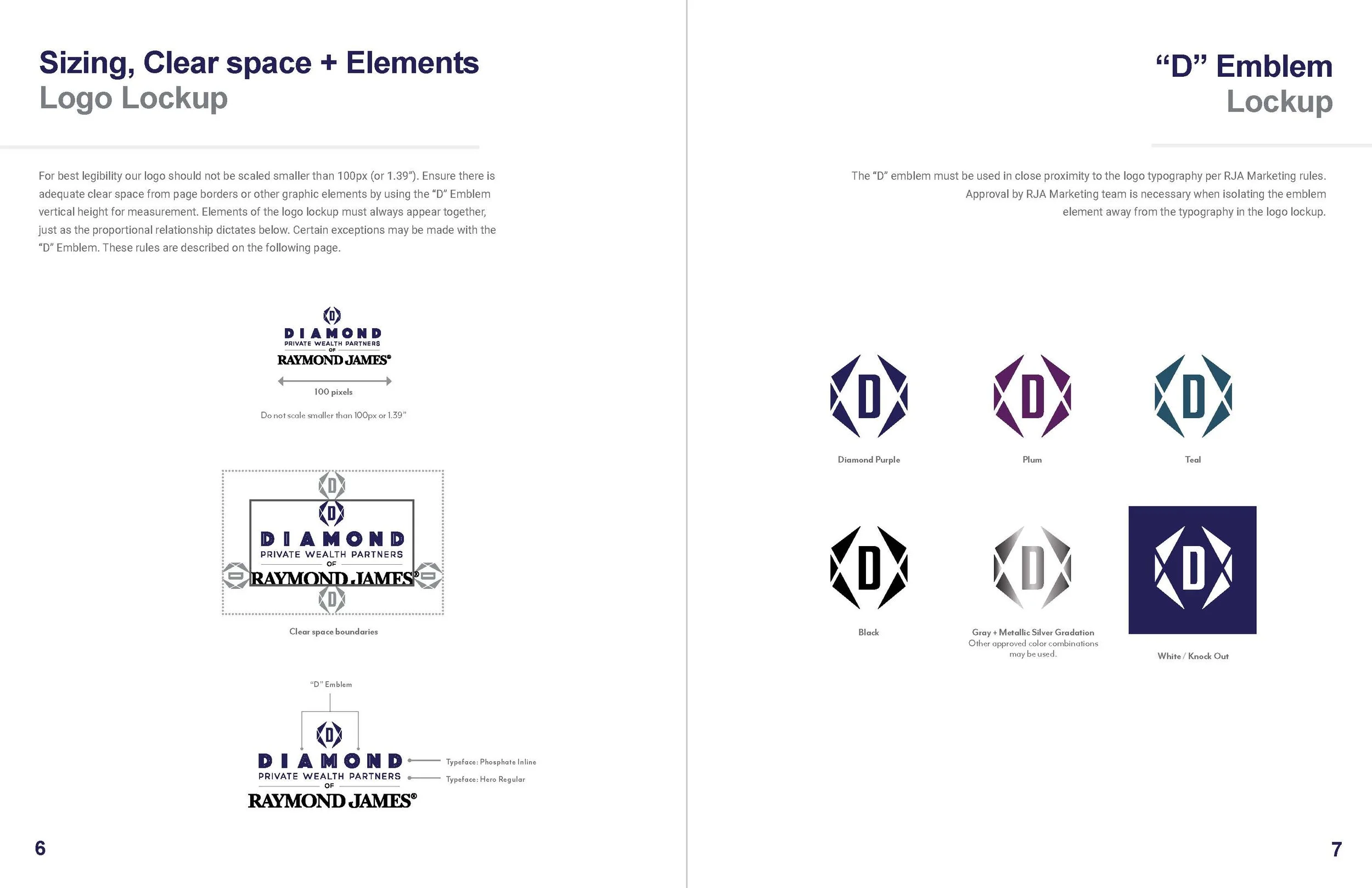
When Marty Diamond, founder of Diamond Private Wealth Partners, reached out to us, he sought a standout brand identity as multifaceted as his team’s approach to wealth management. Leveraging its affiliation with Raymond James, we developed modern brand design systems that balanced stringent financial regulations with Marty’s personal touch, resulting in a brand that honors his legacy while meeting industry standards.
Logo Design & Emblem:
A Legacy Reimagined
At the heart of the brand is the Diamond 'D' Emblem, inspired by a treasured napkin sketch from Marty’s father that dates back decades. We took this sentimental piece, transforming it into a modern symbol of trust and forward-thinking excellence, giving it a fresh perspective while honoring its rich heritage.
Crafting a Cohesive Brand Identity
We developed a range of co-branded logo lockups for Raymond James and crafted a cohesive visual and verbal language for their new website and marketing materials. Each element was meticulously designed to balance creativity with compliance, ensuring a harmonious blend of type sizes, spacing, and color usage that maintained the integrity of both brands.
Custom Website Design,
Photoshoot & Visual Look & Feel
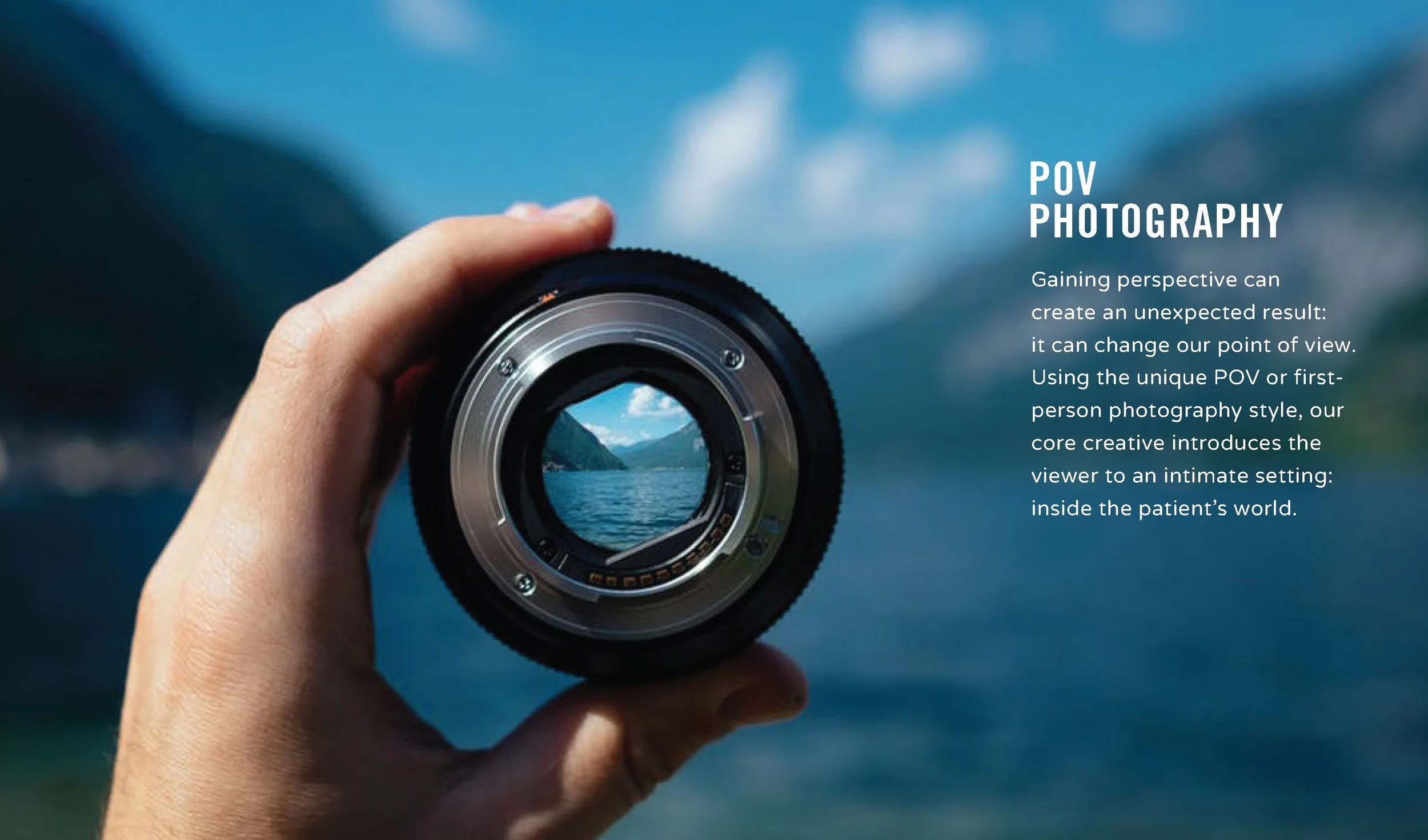
To showcase the team’s genuine personalities, we conducted a full-day photoshoot at The Art Factory in Paterson, capturing the raw essence of who they are. The imagery we created combined dynamic, nature-inspired visuals with a refreshing departure from the typical “suit and tie” look, embodying an aspirational spirit akin to “sunrise kayaking.” This visual strategy seamlessly blends financial expertise with warmth and wit, making it relatable and inviting.
Looking Ahead to 2025
As we head into 2025, we’re thrilled to keep supporting Diamond Private Wealth Partners with event design, strategy, and engaging social media content that reflects their unique brand. This partnership proves that even in regulated industries, innovative branding can thrive with the right blend of creativity, expertise, and compliance.
Let’s elevate your brand next!
Electrifying Education:
Lexia Learning's Logo Leads to Brand Transformation
Rosetta Stone, Lexia Learning & Cambium
We supercharged Lexia Learning's brand identity, starting with the dynamic Lexia Lightning Bolt—a symbol crackling with educational energy. This emblem, seamlessly integrating the 'L' wordmark, became the cornerstone of our "Our Proof ⚡️ is Your Power" campaign. The lightning bolt, fusing awards and letters, sparked a multi-channel marketing blitz that lit up digital news, social media, ads, and PR efforts. Our electrifying approach led to Lexia's most successful campaign in 14 years, prompting a full rebrand invitation.
Following Cambium Group's acquisition, we were invited to reshape several brand identities including the "All for Literacy" super brand campaign, unifying Lexia and Voyager Sopris Learning (VSL) and Cambium. Our holistic approach encompassed logo systems, brand guidelines, vibrant social media content, and website design. By infusing 'sparks' of curiosity into hero images and maintaining a cohesive visual and verbal identity across Lexia's diverse portfolio, we didn't just rebrand—we revolutionized how Lexia connects with educators and students alike.


Branding, Pattern Designs & Web Design
Jacqueline & Jac sought modern and playful branding for their kids' accessories line. We designed a contemporary mark using the initials J&J, which is proudly featured on all their merchandise. Our creative touch extended to logos, clothing patterns, illustrations, packaging, curated ads, lookbooks, and website design, reinforcing the brand's playful essence for a cohesive presence.
Jacqueline & Jac


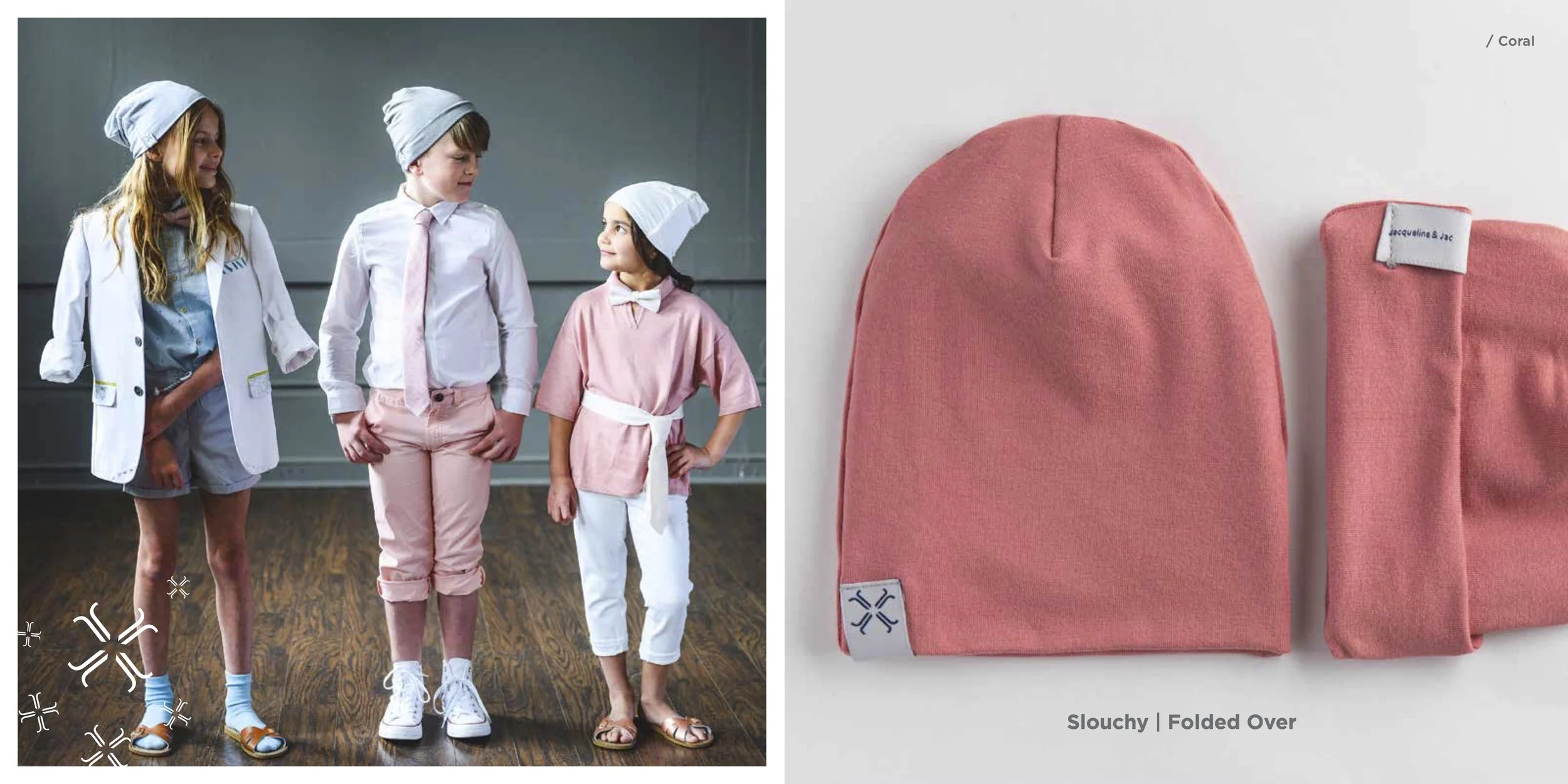


Clothing Pattern Designs,
Package Design & Look Books
Logo Design & Cafe Graphics
Pour Me Coffee & Wine Bar
We designed the brand logo, color palettes, and menu for a family-friendly eatery in downtown Danbury, Connecticut. This rebrand was personal for us, bringing back nostalgic memories of our graphic design work for Chock Full’o Nuts cafes two decades ago.
274 main street, danbury, ct 06810
— In partnership with Betsy Brand of BrandMark Studios™ —
Interior Design Logo & Branding Materials
Rachel Belden Interior Design
We crafted a sophisticated visual identity for Rachel Belden, an esteemed interior designer with over two decades of experience serving residential clients. Our goal was to create a visual identity commensurate with her expertise and professionalism in the interior design industry. Rachel's original and engaging design approach, combined with her architectural planning skills, deserved a brand system that elevated her marketing and sales.
— In partnership with Betsy Brand of BrandMark Studios™ —
The logo we crafted for Rachel Belden merges her initials, "R" and "B," into a sleek design resembling a welcoming door, symbolizing her dedication to creating inviting, elevated spaces. The clever mirroring effect forms a sophisticated Greek-key-inspired motif, adding a touch of elegance and reinforcing brand recognition. Vibrant orange hues, inspired by Rachel’s love for warm colors, create an immediate emotional connection with clients. With clean lines and innovative composition, this visual identity not only sets Rachel apart in the competitive interior design world but also seamlessly adapts across both print and digital platforms, forming the backbone of her marketing efforts.
- In parternship with Betsy Brand of BrandMark Studios -
website
discontinued :(
website + design
website
Pharmaceutical Branding That Soars: The Hemlibra Revolution!
Genentech Global / Hemlibra for Hemophilia A
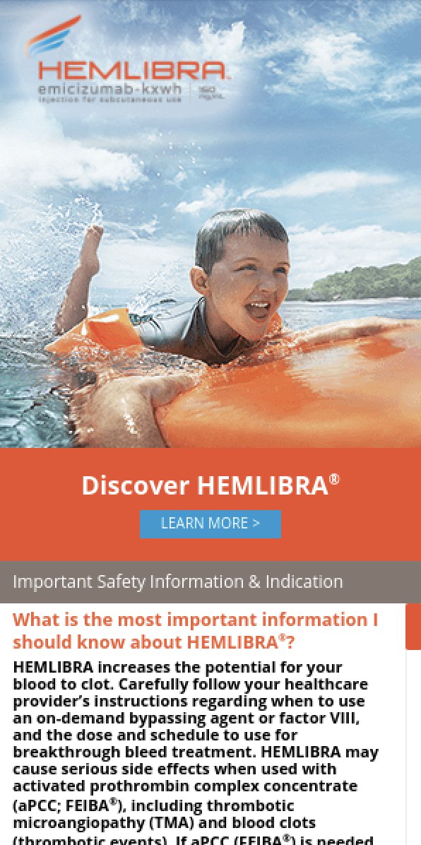
We proudly unveiled a bold logo and captivating brand identity for Hemlibra, Genentech’s groundbreaking treatment for Hemophilia A. Inspired by the mythical power of a bird's wing, our design symbolizes newfound freedom and strength. The logo radiates fluidity, energy, and vibrancy, perfectly reflecting the essence of Hemlibra and its mission to empower patients.
Navigating Pharma with Flair!
Logo Lockups & Design Systems
With decades of experience in the healthcare industry, our talented team expertly navigated the complex landscape of pharmaceutical regulations. We crafted multiple logo iterations that comply with essential guidelines on generic names, dosages, and fair balance, ensuring Hemlibra stands out while remaining compliant.
Your Go-To Branding Guide for Pharma Success!
We developed a comprehensive 75-page branding guideline tailored to the unique demands of the pharma industry. This guide was Genentech’s roadmap to seamless branding integration in all of Hemlibra’s marketing materials. It features detailed visual systems, inspiring color palettes, messaging and tone of voice, logo usage rules, and guiding principles for a cohesive brand identity across print, packaging, digital marketing, videos, and websites. Whether reaching healthcare professionals (HCP) or direct to consumers (DTC), we ensured Hemlibra’s message was clear, engaging, and effective.
Print & Digital Ads
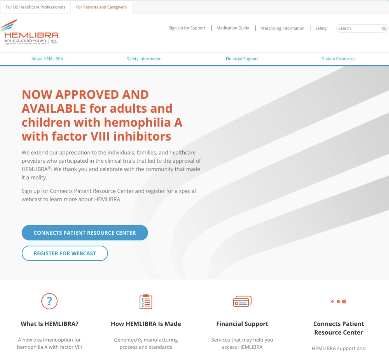
Package Design & Website Design
Why Choose Us for Your Pharmaceutical Branding?
Ready to elevate your pharmaceutical brand with a creative edge? Let us help you transform your vision into a powerful identity that resonates with your audience. Contact Us Today.
RYL GROUP CONSTRUCTION
Logo Design for Long Island Construction Company
Pfizer / Estring
Brand Identity
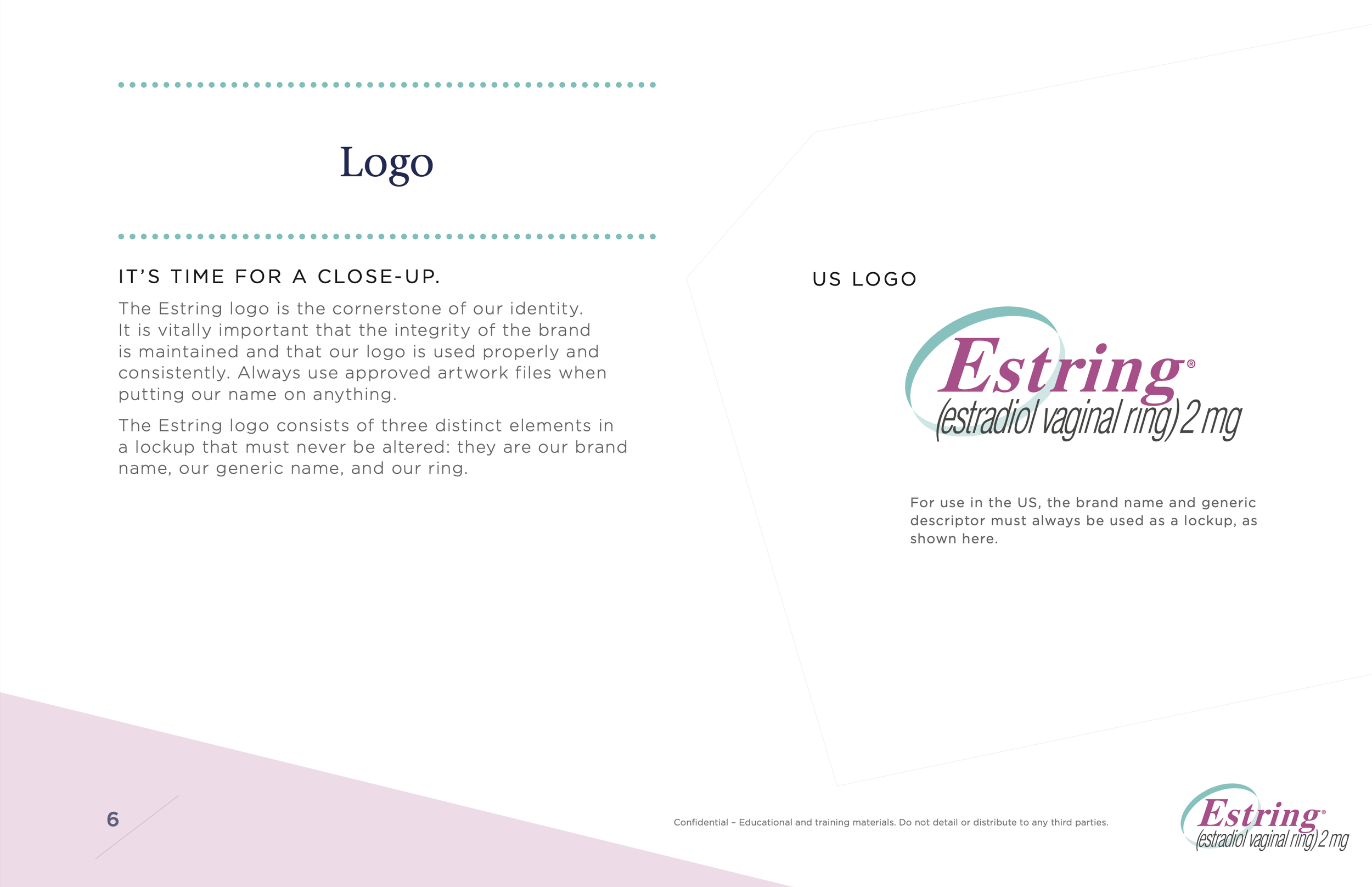
Pfizer did not want to change their logo. They’d built solid brand recognition for their longstanding Women’s Health brand Estring. However, they acknowledged the brand's outdated image they worked with us to create a new visual identity and personality. Initially envisioned as "subtle logo enhancements," the project blossomed into a comprehensive brand refresh, featuring a shiny new brand personality, story, visual brand identity, and an overhauled website and instructional videos.
Visual Refresh
BRANDING FROM EARLIER YEARS
Brand Identity
While subtle, our logo refinement introduced a new, more dynamic ring shape, more vibrant and contemporary color palette as the north star for the fuller brand refresh.
Brand Personality & Style Guides
We designed and wrote content for a 20-page guide as a compass for maintaining our new, unified brand image. It crystallizes our modernized creative approach, outlines enhanced color palettes, typogrpahy, sets new logo usage rules, a new brand personality, tone, voice, photography stylizations and design for marketing materials, ensuring consistent and impactful communication across both healthcare professional (HCP) and direct-to-consumer (DTC) audiences.
Meet Estie the Brand Ambassador
Estie, our friendly brand ambassador, is the bridge between pharmaceutical intricacies and patient experience. As a guiding presence, she navigates patients through the entire Estring journey, offering comfort and information without intimidation. With a spirit of compassion and understanding, Estie embodies the essence of the Estring brand.
Web Design
Instructional Video & Materials
— In-house partnership with Saatchi & Saatchi Health NY —


